The new plan shopping experience
T-Mobile had the best offerings and retail experience in the industry, but its e-commerce experience was playing catch-up: the experience was fractured information was inconsistent, teams were territorial, and getting small wins took an act of congress.
So, when the order came to modernize the experience to accommodate new plans, I knew it wasn’t going to be easy. But it was going to be fun ride. And I was going to find a way to improve the experience, no matter the headwind.
Role UX Design lead
Timeline 2 months
Tools Figma, Miro, Qualtrics XM, Amplitude
Team Product, Engineering, UX Research, Technical Product Management, Marketing
“We want to be able to sell a potentially unlimited number of plans.”
The existing plan shopping experience spread across two separate pages (one marketing, one transactional), each showing a fixed 3 plans in a static table with exhaustive feature lists. Customers were confused by the pricing, unable to effectively differentiate between the 3 plans on offer, and the architecture couldn't accommodate new plans or types.
Across exhaustive qualitative and quantitative research, existing and commissioned, the key insights that emerged was that customers.
If we give customers more decision-making tool, will they just pick the cheap plans?
This was a genuine business concern—justifiably!—and one all designers have encountered: the fear that a redesign will lead to a decrease in an important business metric. T-Mobile is in the subscription telecom business, so finding the right balance of customer and business satisfaction was critical.
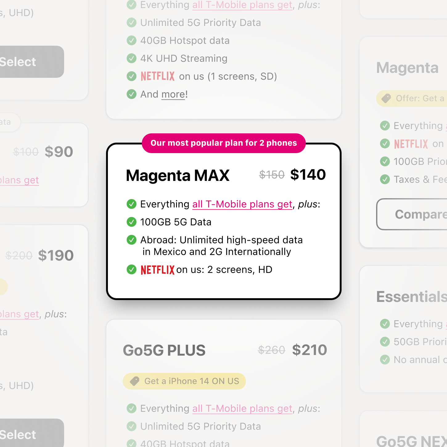
I addressed these fears by assembling and conducting research around customer multi-tier purchasing decisions, and built a case, based on this research, for a visually differentiated “good-better-best” presentation that used scale and quantity to contrast the offerings, presenting plans equally, but visually indicating the plans with more or less features and simple pricing. This leaves the shopper to make the value determination independently.
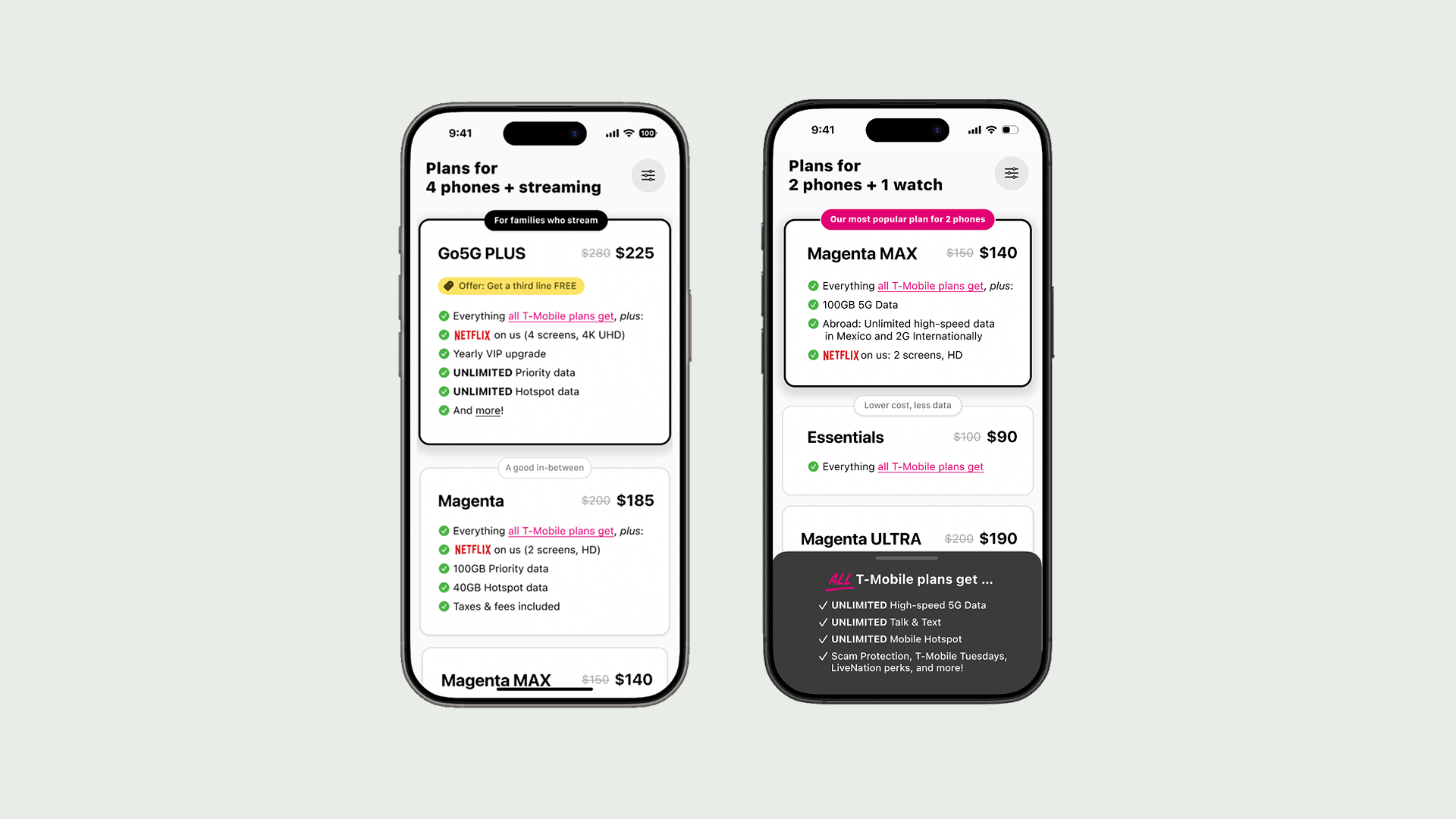
Internal tension: letting go of more.
Shoppers struggled to scan plans and differentiate between them. Which one is which, again?
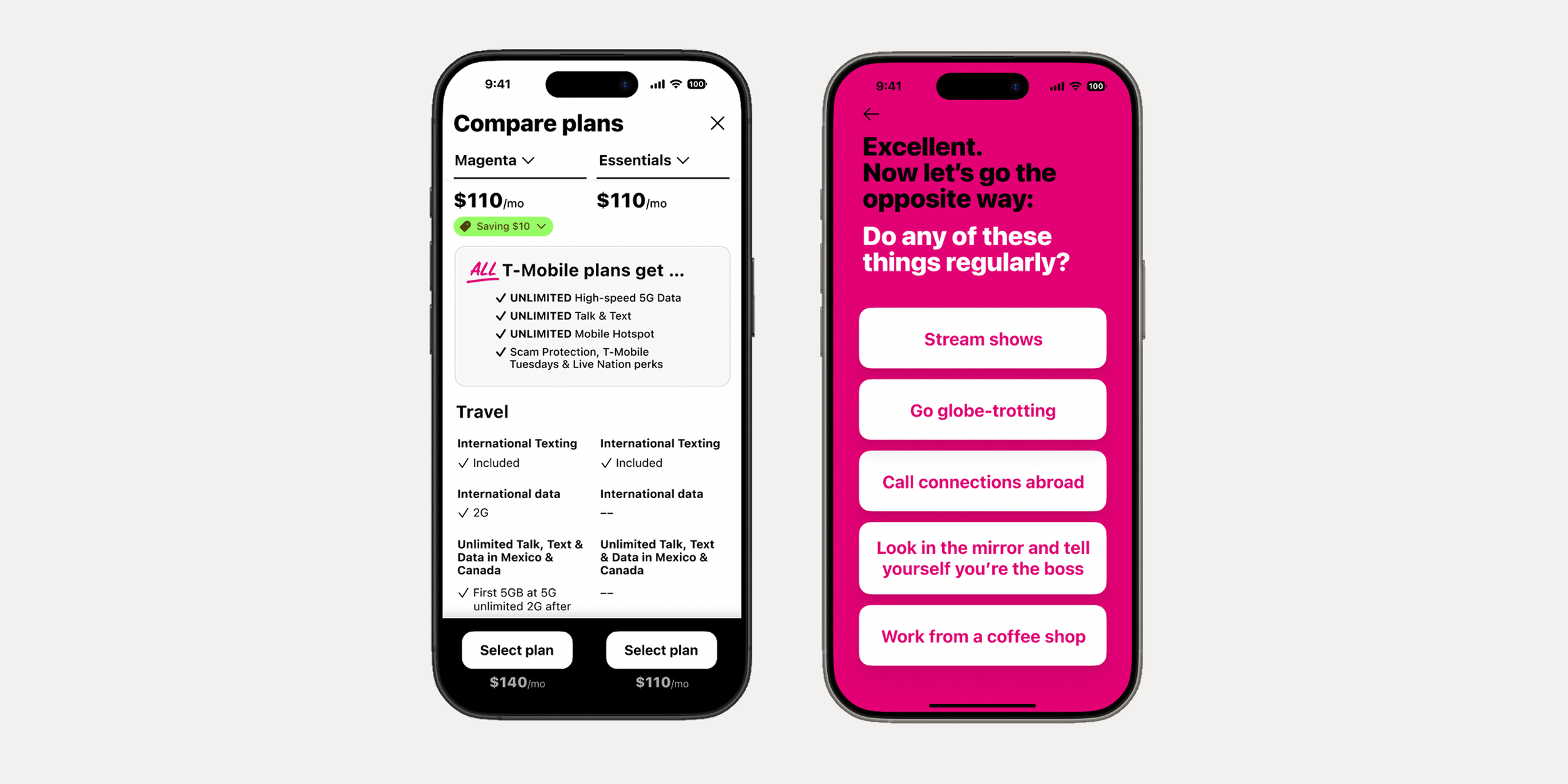
The design matches plan information to what is appropriate for the shopper’s phase in the decision-making journey: information gathering, refining, confirming. It separates differentiating and universal features, showing key decision-making features of each plan (and functioning as the “thumbprint”), making it easier for shoppers to orient, then refine.
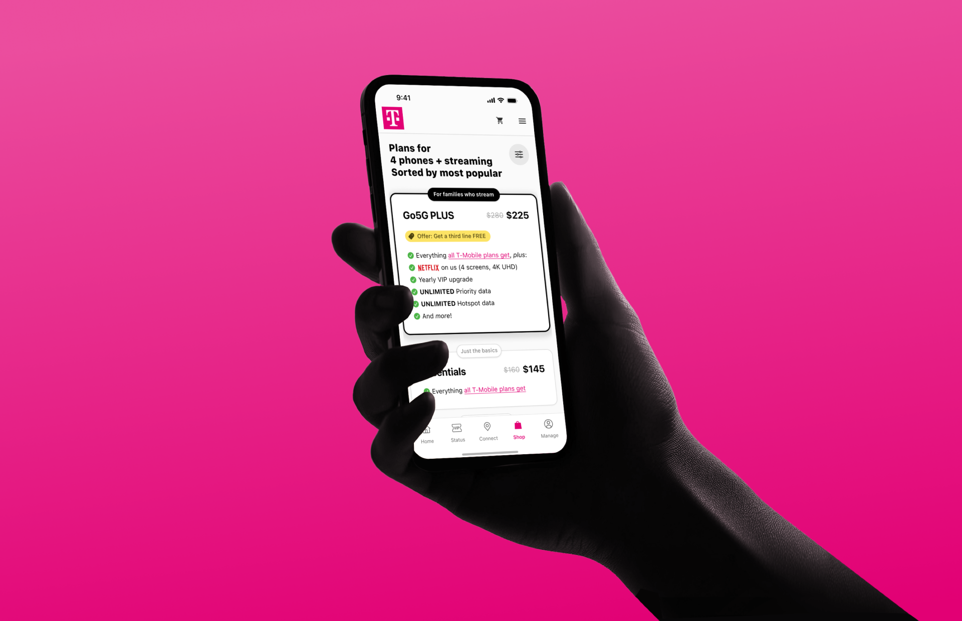
The design uses a new model for merchandising plans, optimized for flexibility of display and extensibility, presenting the plans as compact cards. Organizable as customer or business priorities demand, natural for mobile, and forcing design for scanability and digestibility.
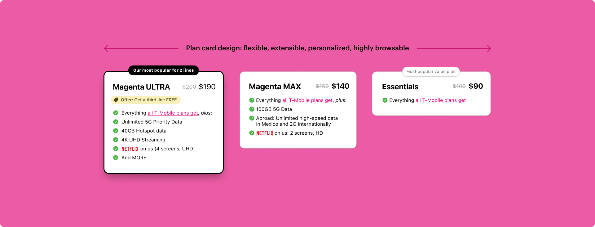
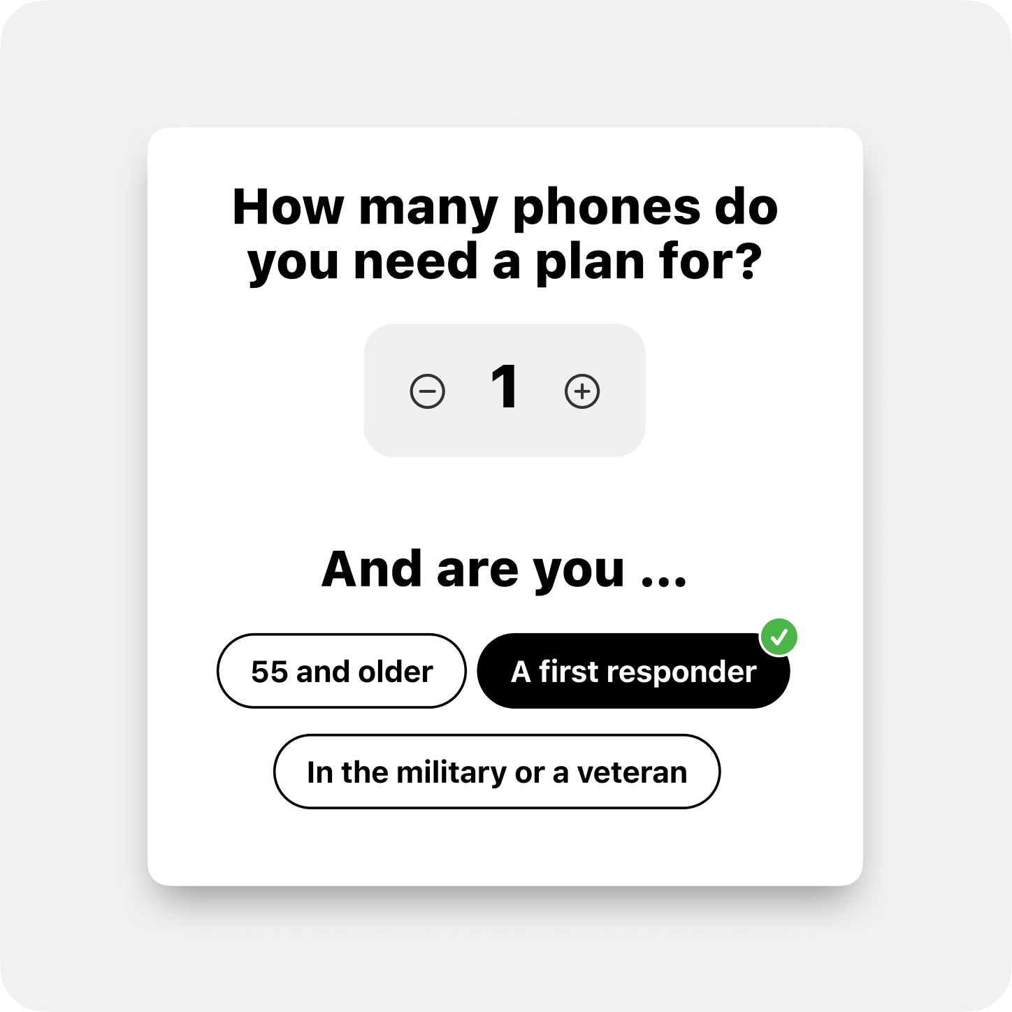
No two shoppers are the same, so the design introduced decision-support features to aid many decision-making styles find the right plan from among many: need-based filtering & sorting, trust & social-proof badges, plan matchmaking, plan comparison.
Result: higher satisfaction, fully extensible, strong business performance.
Customers reported higher satisfaction in their chosen plans, and in the experience of finding one. We observed reduced plan changes within 90 days. As for the purchase funnel impact, average daily orders and cart values increased, proving once again that better experiences deliver better business results as well.